The following default options are provided by the plugin. They can be overridden and customized by passing options object to the initialization of the plugin and by using HTML5 data attributes on the container element.
Which section is current open when page is loaded. Setting active to false (active: false) will collapse all sections.
Setting active to a number (active: 1), it will open section based on the given index. Starting from zero. The third options is to use array (active:[0,1,3]) which means you can open multiple sections on page load.
$('#demo-accordion').zozoAccordion({
    active: false
});
<div id="demo-accordion" data-role="z-accordion" data-options='{"active": false}'>
    ...
this object holds settings about animation, Setting the effects option to none will disable all animations.
$('#demo-accordion').zozoAccordion({
    animation: {
        duration: 600,
        easing: "easeInQuad",
        type: "css"
    }
});
<div id="demo-accordion" data-role="z-accordion" data-options='{"animation": {"duration": 600, "easing": "easeInQuad", "type": "css"}}'>
    ...
Number determining how long the animation will run, default value is 600
$('#demo-accordion').zozoAccordion({
    animation: {
        duration: 600'
    }
});
<div id="demo-accordion" data-role="z-accordion" data-options='{"animation": {"duration": 600"}}'>
    ...
Default value is 'swing' or 'easeOutQuart' when jQuery easing plugin is included. All effects except 'linear' and 'swing' require the easing plugin. List of easing effects is on the easing website. jQuery easing plugin is completely optional for advanced easing.
$('#demo-accordion').zozoAccordion({
    animation: {
        easing: "easeInQuad"
    }
});
<div id="demo-accordion" data-role="z-accordion" data-options='{"animation": {"easing": "easeInQuad"}}'>
    ...
Default value is "jquery" for desktops and css for mobile and tablets (CSS transitions for superfast performance). When it's set to css, it will use CSS transitions with jQuery fallback.
$('#demo-accordion').zozoAccordion({
    animation: {
        type: "css"
    }
});
<div id="demo-accordion" data-role="z-accordion" data-options='{"animation": {"type": "css"}}'>
    ...
Autoplay can be enabled via accordion options. Delay between items can be set via interval property of autoplay. When smart is enabled, autoplay will stop at first user action
$('#demo-accordion').zozoAccordion({
    autoplay: {
        interval: 2000,
        smart: true
    }
});
<div id="demo-accordion" data-role="z-accordion" data-options='{"autoplay": {"interval": 2000, "smart": true}}'>
    ...
Default value is null for interval (in milliseconds).
$('#demo-accordion').zozoAccordion({
    autoplay: {
        interval: 3000'
    }
});
<div id="demo-accordion" data-role="z-accordion" data-options='{"autoplay": {"interval": 3000"}}'>
    ...
Default value is null for interval (in milliseconds).
$('#demo-accordion').zozoAccordion({
    animation: {
        smart: true'
    }
});
<div id="demo-accordion" data-role="z-accordion" data-options='{"autoplay": {"smart": 3000"}}'>
    ...
Apply borders to Accordion. The default is false.
$('#demo-accordion').zozoAccordion({
    bordered: true
});
<div id="demo-accordion" data-role="z-accordion" data-options='{"bordered": true}'>
    ...
By default every single AJAX requests are cached after the first time.
$('#demo-accordion').zozoAccordion({
    cacheAjax: false
});
<div id="demo-accordion" data-role="z-accordion" data-options='{"cacheAjax": false}'>
    ...
Determines the content height of accordion. Note: This is only applied when orientation option is set to "vertical".
$('#demo-accordion').zozoAccordion({
    contentHeight: 170
});
<div id="demo-accordion" data-role="z-accordion" data-options='{"contentHeight": 170}'>
    ...
Set contentNav to true it and add ul list inside accordion as second level navigation. Note: This is only useful when orientation option is set to "vertical". Accordion will displayed as a vertical navigation menu..
$('#demo-accordion').zozoAccordion({
    contentNav: true
});
<div id="demo-accordion" data-role="z-accordion" data-options='{"contentNav": true}'>
    ...
Determines the spacing between the accordion sections, Note: This is only applied when orientation option is set to "vertical".
$('#demo-accordion').zozoAccordion({
    contentSpacing: 6
});
<div id="demo-accordion" data-role="z-accordion" data-options='{"contentSpacing": 6}'>
    ...
The content urls to load acooriond content with AJAX. The url can also a link to external site and in that case the options iframe should be true as well to load iframe content via AJAX.
$('#demo-accordion').zozoAccordion({
    contentUrls: [
        "ajax-content/content1.html",
        "ajax-content/content2.html",
        "ajax-content/content3.html",
        "ajax-content/content4.html"
    ]
});
<div id="demo-accordion" data-role="z-accordion" >
    <section>
        <h3 data-content-url="ajax-content/content1.html" >Getting Started</h3>
        <div></div>
    </section>
    <section>
        <h3 data-content-url="ajax-content/content2.html" >Configuration</h3>
        <div></div>
    </section>
    <section>
        <h3 data-content-url="ajax-content/content3.html" >Methods</h3>
        <div></div>
    </section>
    <section>
        <h3 data-content-url="ajax-content/content4.html" >Events</h3>
        <div></div>
    </section>
</div>
Adds dot navigation for accordion slider. Note: This is only applied when slider option is set to true.
$('#demo-accordion').zozoAccordion({
    dotNav: true
});
<div id="demo-accordion" data-role="z-accordion" data-options='{"dotNav": true}'>
    ...
The type of event that the accordion header will react to in order to activate the associated content panel. To activate on hover, use "mouseover". When a mobile device is detected it will use the mobile touchend event (without 300ms delay).
$('#demo-accordion').zozoAccordion({
    event: "mouseover"
});
<div id="demo-accordion" data-role="z-accordion" data-options='{"event": "mouseover"}'>
    ...
Specifies how the Accordion section are displayed when opened and closed. There are two options available: "single" and "multiple", Note: This is only applied when orientation option is set to "vertical".
$('#demo-accordion').zozoAccordion({
    expandMode: "multiple"
});
<div id="demo-accordion" data-role="z-accordion" data-options='{"expandMode": "multiple"}'>
    ...
Section header font size. It's useful for responsive an normal accordion. It will add in em value to header h3 tag.
$('#demo-accordion').zozoAccordion({
    headerFontSize: 2.1
});
<div id="demo-accordion" data-role="z-accordion" data-options='{"headerFontSize": 2.1}'>
    ...
Determines the header width of horizontal accordion and the height of vertical accordion.
$('#demo-accordion').zozoAccordion({
    headerSize: 56
});
<div id="demo-accordion" data-role="z-accordion" data-options='{"headerSize": 56}'>
    ...
Determines the height of horizontal accordion. Note: This is only applied when orientation option is set to "horizontal".
$('#demo-accordion').zozoAccordion({
    height: 260
});
<div id="demo-accordion" data-role="z-accordion" data-options='{"height": 260}'>
    ...
Enable keyboard navigation
$('#demo-accordion').zozoAccordion({
    keyboard: true
});
<div id="demo-accordion" data-role="z-accordion" data-options='{"keyboard": true}'>
    ...
This option is part of responsive feature, used for switching from horizontal to vertical when minWindowWidth is executed
$('#demo-accordion').zozoAccordion({
    minWindowWidth: 600
});
<div id="demo-accordion" data-role="z-accordion" data-options='{"minWindowWidth": 600}'>
    ...
The orientation of the accordion, accepts either "horizontal" or "vertical".
$('#demo-accordion').zozoAccordion({
    orientation: "horizontal"
});
<div id="demo-accordion" data-role="z-accordion" data-options='{"orientation": "horizontal"}'>
    ...
Remember the accordion toggle state. The data is saved in HTML5 LocalStorage. Also the accordion id is required in order to save it.
$('#demo-accordion').zozoAccordion({
    rememberState: true
});
<div id="demo-accordion" data-role="z-accordion" data-options='{"rememberState": true}'>
    ...
Compatible with Tablet, Desktop and Mobile. The layout of the components are scaled according to resolution of the device, thus more consistent regardless of the device. this option doesn't to applied to vertical accordion, it's by default responsive and will take the full width of the parent container.
$('#demo-accordion').zozoAccordion({
    responsive: false
});
<div id="demo-accordion" data-role="z-accordion" data-options='{"responsive": false}'>
    ...
This options is used for responsive accordion. Determines timer delay in ms when resizing the browser window. For smoother performance set it 0 and better performance set to heigher number. This options does not change the functionality of responsive accordion.
$('#demo-accordion').zozoAccordion({
    responsiveDelay: 0
});
<div id="demo-accordion" data-role="z-accordion" data-options='{"responsiveDelay": 0}'>
    ...
Apply CSS3 rounded corners to accordion, Note: Rounded corners is only supported in modern browers.
$('#demo-accordion').zozoAccordion({
    rounded: true
});
<div id="demo-accordion" data-role="z-accordion" data-options='{"rounded": true}'>
    ...
Enables custom styled scrollbar for Webkit when the content of the accordion section is larger than it's height. Also the contentHeight option should be set. Note: custom styled scrollbar is only supported in Webkit browsers, other browser will have the standard scrollbar.
$('#demo-accordion').zozoAccordion({
    scrollable: true,
    contentHeight: 200
});
<div id="demo-accordion" data-role="z-accordion" data-options='{"scrollable": true, "contentHeight": 200}'>
    ...
Apply CSS3 shadows to Accordion, Note: Shadows is only supported in modern browers.
$('#demo-accordion').zozoAccordion({
    shadows: false
});
<div id="demo-accordion" data-role="z-accordion" data-options='{"shadows": false}'>
    ...
Display and hide accordion icons. Default value is true.
$('#demo-accordion').zozoAccordion({
    showIcons: false
});
<div id="demo-accordion" data-role="z-accordion" data-options='{"showIcons": false}'>
    ...
Use accordion as a slider. Add an image in each accordion content panel. For more live example see the slider demo in included examples.
$('#demo-accordion').zozoAccordion({
    slider: true
});
<div id="demo-accordion" data-role="z-accordion" data-options='{"slider": true}'>
    ...
Determines the spacing of each section of vertical accordion. When it's set to 0, the accordion will be displayed as group otherwise it will be separate panel. The sectionSpacing will be used spacing between the section panels. Note: This is only applied when orientation option is set to "vertical".
$('#demo-accordion').zozoAccordion({
    sectionSpacing: 6
});
<div id="demo-accordion" data-role="z-accordion" data-options='{"sectionSpacing": 6}'>
    ...
10 built-in themes that are ready to go (white, crystal, silver, gray, black, orange, red, green, blue, deepblue)..
$('#demo-accordion').zozoAccordion({
    theme: "blue"
});
<div id="demo-accordion" data-role="z-accordion" data-options='{"theme": "blue"}'>
    ...
Determines the width of horizontal accordion. Note: This is only applied when orientation option is set to "horizontal".
$('#demo-accordion').zozoAccordion({
    width: 1200
});
<div id="demo-accordion" data-role="z-accordion" data-options='{"width": 1200}'>
    ...
Methods
Selects a specified section by index and displays the linked content.
$("#demo-accordion").data("zozoAccordion").select(1);
Parameters
- index
int
-
The index of the section
Selects the previous section and displays the linked content.
$("#demo-accordion").data("zozoAccordion").prev();
Selects the next section and displays the linked content.
$("#demo-accordion").data("zozoAccordion").next();
Selects the first section and displays the linked content.
$("#demo-accordion").data("zozoAccordion").first();
Selects the last section and displays the linked content.
$("#demo-accordion").data("zozoAccordion").last();
Set options by passing object which contains single or multiple options, read more about those settings in the options
$("#demo-accordion").data("zozoAccordion").setOptions({
    orientation: "horizontal",
    expandMode: "multiple",
    theme: "green"
});
Parameters
- options
object
-
accordion options object
Automatically progress through next section.
$("#demo-accordion").data("zozoAccordion").play({
    interval: 5000
});
Parameters
- interval
int
-
The interval at which the sections should progress at in milliseconds.
Stops autoplay.
$("#demo-accordion").data("zozoAccordion").stop();
Events
This event is triggered when a section is selected.
var onselect = function(event, item) {
    console.log(item.index);
    console.log(item.header);
    console.log(item.content);
};

$("#demo-accordion").zozoAccordion({
    select: onselect
});
Event Data
- event
event
-
The event data object
- item.index
Number
-
The index of the selected section panel.
- item.header
HTMLElement
-
The header element of the selected section panel.
- item.content
HTMLElement
-
The content element of the selected section panel.
This event is triggered after a section has been activated.
var onActivate = function(event, item) {
    console.log(item.index);
    console.log(item.header);
    console.log(item.content);
};

$("#demo-accordion").zozoAccordion({
    activate: onActivate
});
Event Data
- event
event
-
The event data object
- item.index
Number
-
The index of the activated section panel.
- item.header
HTMLElement
-
The header element of the activated section panel.
- item.content
HTMLElement
-
The content element of the activated section panel.
This event is triggered after section content is loaded with AJAX.
var onContentLoad = function(event, item) {
    console.log(item.index);
    console.log(item.header);
    console.log(item.content);
};

$("#demo-accordion").zozoAccordion({
    contentLoad: onContentLoad
});
Event Data
- event
event
-
The event data object
- item.index
Number
-
The index of the section panel which is loaded with AJAX.
- item.header
HTMLElement
-
The header element of the section panel which is loaded with AJAX.
- item.content
HTMLElement
-
The content element of the section panel which is loaded with AJAX.
This event is triggered AJAX request results in an error.
var onError = function(event, xhr) {
    console.dir(xhr.status);
    console.dir(xhr.statusText);
};

$("#demo-accordion").zozoAccordion({
    error: onError
});
Event Data
- event
event
-
The event data object
- xhr
jQuery XHR Object
-
The jQuery XHR object which is used to load the content.
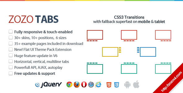
Featured UI Component: Tabs
UI Components by Zozo UI
Zozo Tabs - Fully Responsive and touch-enabled jQuery Tabs plugin
jQuery Tabs Plugin
Zozo Tabs is a user-friendly, fully customizable, responsive jQuery tabs plugin to take any HTML content, including images, videos and display it in a clean organised and responsive tabbed navigation. It works out of the box, making it simple to create beautiful but powerful enough to build branded and highly customized tabs.
View Demos
View Docs