Getting Started
Buy it for only $7 Live Examples
Getting started with Zozo Tabs is very easy and straightforward
A) Unzip and place
- 1Unzip the contents of the file which you downloaded from codecanyon.net.
- 2Place zozo.tabs.min.css in the directory assets/css/ of your website or project.
- 3Place z-tabs-icons.png and loading-image.gif in the directory assets/img/ of your website or project.
- 4Place zozo.tabs.min.js and jquery.min.js (already included in the assets/js folder) in the directory assets/js/ of your website or project.
    Zozo Tabs
    ├── assets/
        ├── css/
        │   └── zozo.tabs.min.css
        ├── img/
        │   ├── z-tabs-icons.png (Mobile)
        │   └── loading-image.gif (AJAX)
        └── js/
            ├── jquery.min.js
            └── zozo.tabs.min.js
You should have the above directory structure for website/app. Please note: Most site already includes jQuery. If your site already includes jQuery or jQuery Easing plugin, do not include them and remove it from above includes. If you want to know how to include and use the new flat themes, read the following article: How to use Flat Themes.
B) Installation
Installing Zozo Tabs is very easy and straight-forward.
Simply add the following link and scripts tags with your proper paths and paste the following code within the <head></head> tags of your HTML document.
<link href="/assets/css/zozo.tabs.min.css" rel="stylesheet">
<script src="/assets/js/jquery.min.js"></script>
<script src="/assets/js/zozo.tabs.min.js"></script>
You are now ready to use Zozo Tabs in your website or poject.
The final step is to activate our Tabs. Zozo Tabs is very easy to use and very flexible becuase we can activate it using jQuery selector like any other plugin, but we can also activate it using HTML5 data attributes. That means no JavaScript/jQuery skills are required. Just use one of the method below C or D.
C) Usage: using jQuery selector - top
This section assumes that you have already included Zozo Tabs required files as described in section Installation. Creating Zozo Tabs is very simple. All we need is to create the basic HTML markup for our Tabs and activate it using jQuery selector.- 1The basic HTML markup
Below the basic HTML markup for our Tabs, a div element which contains sections. Inside each section tag we have a h3 tag for the header and div tag for it's content. Paste the following HTML anywhere within the
<body></body>tag:<div id="tabbed-nav"> <ul> <li><a>Design</a></li> <li><a>Specs</a></li> <li><a>Price</a></li> <li><a>Release Date</a></li> </ul> <div> <div>Design</div> <div>Specs</div> <div>Price</div> <div>Release Date</div> </div> </div> - 2Activate using jQuery selector
Below we using jQuery's selector within $(document).ready() to ativate our Tabs. In the below example change a few options for our Tabs. Check the online documentation for Extended HTML documentation. Paste the following code just before
</body>tag:<script> document.onreadystatechange = function () { if (document.readyState === "interactive" || document.readyState === "complete") { $("#tabbed-nav").zozoTabs({ theme: "silver", animation: { duration: 800, effects: "slideH" } }); } }; </script>
D) Usage: using HTML5 data attributes- top
This section assumes that you have already included Zozo Tabs required files as described in section Installation.This the second way to create Zozo Tabs using HTML5 data attributes and we don't need additional JavaScript code. The basic HTML markup stays the same. We are going to add a few HTML5 data attributes. The first one is data-role of "z-Tabs" which is required to activate the tabs. In below example we are also including data-options attribute to change the theme and other options. These data- attributes are used throughout Zozo Tabs to transform basic markup into an enhanced and styled widget.
That means we only need the following HTML markup with HTML5 data attributes and past it anywhere within the <body></body> tag:
<div id='tabbed-nav' data-role='z-tabs' data-options='{"theme": "silver", "animation": {"duration": 800, "effects": "slideH"}}'>
  <ul>
        <li><a>Design</a></li>
	<li><a>Specs</a></li>
	<li><a>Price</a></li>
	<li><a>Release Date</a></li>
  </ul>
  <div>
	<div>Design</div>
	<div>Specs</div>
	<div>Price</div>
	<div>Release Date</div>
  </div>
</div>
More Tutorials
Options
The following default options are provided by the plugin. They can be overridden and customized by passing options object to the initialization of the plugin and by using HTML5 data attributes on the container element.
animation - Object (default: 'Object')
this object holds settings about animation, Setting the effects option to none will disable all animations.
$('#tabbed-nav').zozoTabs({
    animation: {
        duration: 600,
        effects: "slideV",
        easing: "easeInQuad",
        type: "css"
    }
});
<div id="tabbed-nav" data-role="z-tabs" data-options='{"animation": {"duration": 600, "effects": "slideV", "easing": "easeInQuad", "type": "css"}}'>
    ...
animation.duration - Number (default: '600')
Number determining how long the animation will run, default value is 600
$('#tabbed-nav').zozoTabs({
    animation: {
        duration: 600
    }
});
<div id="tabbed-nav" data-role="z-tabs" data-options='{"animation": {"duration": 600"}}'>
    ...
animation.effects - String (default: 'slideV')
Default value is 'slideV'. There are eageightht animation effects: slideH, slideLeft, slideRight, slideV,slideUp, slideDown,slideUpDown, fade and you can set it o none to disable animation.
$('#tabbed-nav').zozoTabs({
    animation: {
        effects: "slideV"
    }
});
<div id="tabbed-nav" data-role="z-tabs" data-options='{"animation": {"effects": "slideH"}}'>
    ...
animation.easing - String (default: ''swing' or 'easeInQuad'')
Default value is 'swing' or 'easeInQuad' when jQuery easing plugin is included. All effects except 'linear' and 'swing' require the easing plugin. List of easing effects is on the easing website. jQuery easing plugin is completely optional for advanced easing.
$('#tabbed-nav').zozoTabs({
    animation: {
        easing: "easeInQuad"
    }
});
<div id="tabbed-nav" data-role="z-tabs" data-options='{"animation": {"easing": "easeInQuad"}}'>
    ...
animation.type - String (default: 'css')
Default value is 'swing' or 'easeInQuad' when jQuery easing plugin is included.
All effects except 'linear' and 'swing' require the easing plugin. List of easing effects is on the easing website. jQuery easing plugin is completely optional for advanced easing.
$('#tabbed-nav').zozoTabs({
    animation: {
        type: "css"
    }
});
<div id="tabbed-nav" data-role="z-tabs" data-options='{"animation": {"type": "css"}}'>
    ...
autoplay - Object (default: 'Object')
Autoplay can be enabled via tab options. Delay between items can be set via interval property of autoplay. When smart is enabled, autoplay will stop at first user action
$('#tabbed-nav').zozoTabs({
    autoplay: {
        interval: 2000,
        smart: true
    }
});
<div id="tabbed-nav" data-role="z-tabs" data-options='{"autoplay": {"interval": 2000, "smart": true}}'>
    ...
bordered - Number (default: 'true')
This options enbales borders. Note: When style option is set to 'clean' or flat themes (v6.0) are enabled. Follow this post how to use flat themes.
$('#tabbed-nav').zozoTabs({
    bordered: false
});
<div id="tabbed-nav" data-role="z-tabs" data-options='{"bordered": false}'>
    ...
cacheAjax - Number (default: 'true')
By default every single AJAX requests are cached after the first time.
$('#tabbed-nav').zozoTabs({
    cacheAjax: false
});
<div id="tabbed-nav" data-role="z-tabs" data-options='{"cacheAjax": false}'>
    ...
contentUrls - Array (default: 'null')
The content urls to load tabs content with AJAX. The url can also a link to external site and in that case the options iframe should be true as well to load iframe content via AJAX.
$('#tabbed-nav').zozoTabs({
    contentUrls: [
        "ajax-content/content1.html",
        "ajax-content/content2.html",
        "ajax-content/content3.html",
        "ajax-content/content4.html"
    ]
});
<div id='tabbed-nav' data-role='z-tabs' data-options='{"theme": "silver"}'>
  <ul>
        <li><a>ThemeForest</a></li>
	<li><a>CodeCanyon</a></li>
	<li><a>Content 1</a></li>
	<li><a>Content 2</a></li>
  </ul>
    <div>
        <div data-content-url='http://www.themeforest.net' data-content-type='iframe'></div>
        <div data-content-url='http://www.codecanyon.net' data-content-type='iframe'></div>
        <div data-content-url='ajax-content/content1.html'></div>
        <div data-content-url='ajax-content/content2.html'></div>
  </div>
</div>
deeplinking - Boolean (default: 'false')
The active tab is set based on the #hash value passed to the url. Makes URL automatically change when you select tabs and you can easily link to specific tab. Step by setp tutorial: Create Bookmarkable Tabs (Deeplinking).
The plugin make use of HTML5 hashchange event. HTML5 hashchange event is supported by all modern browsers. If want cross-browser support for HTML5 window.onhashchange event, you can include jQuery hashchange plugin by Ben Alman. Please note that this is completely optional.
$('#tabbed-nav').zozoTabs({
    deeplinking: true
});
<div id="tabbed-nav" data-role="z-tabs" data-options='{"deeplinking": true}'>
    ...
deeplinkingAutoScroll - Boolean (default: 'false')
Option deeplinkingAutoScroll, auto scroll to top on page load when using hashtage in the url to a specific tab.
$('#tabbed-nav').zozoTabs({
    deeplinking: true,
    deeplinkingAutoScroll: true
});
<div id="tabbed-nav" data-role="z-tabs" data-options='{"deeplinking": true, "deeplinkingAutoScroll": true}'>
    ...
deeplinkingPrefix - String (default: '')
This options is for advanced deeplinking. Add a deeplinkingPrefix when deeplinking is enabled. Note: this will only effect if deeplinking is enabled and deeplinkingSeparator should be set to one of its allowed separator.
$('#tabbed-nav').zozoTabs({
    deeplinking: true,
    deeplinkingPrefix: "products",
    deeplinkingSeparator: "/"
});
<div id="tabbed-nav" data-role="z-tabs" data-options='{"deeplinking": true, "deeplinkingPrefix": "products", "deeplinkingSeparator": "/"}'>
    ...
deeplinkingSeparator - String (default: '')
This options is for advanced deeplinking. Add a separator when deeplinking is enabled. Note: this will only effect if deeplinking is enabled also keep in mind tabs should have an id or deeplinkingPrefix should be set to a string value as prefix (example: products/productA)
$('#tabbed-nav').zozoTabs({
    deeplinking: true,
    deeplinkingPrefix: "products",
    deeplinkingSeparator: "/"
});
<div id="tabbed-nav" data-role="z-tabs" data-options='{"deeplinking": true, "deeplinkingPrefix": "products", "deeplinkingSeparator": "/"}'>
    ...
defaultTab - String (default: 'tab1')
The default selected tab when page is loaded.
$('#tabbed-nav').zozoTabs({
    defaultTab: 'tab2'
});
<div id="tabbed-nav" data-role="z-tabs" data-options='{"defaultTab": "tab2"}'>
    ...
event - String (default: 'click')
The type of event that the tabs should react to in order to activate the tab. To activate on hover, use 'mouseover'. When a mobile device is detected it will use the mobile touchend event (without 300ms delay).
$('#tabbed-nav').zozoTabs({
    event: 'mouseover'
});
<div id="tabbed-nav" data-role="z-tabs" data-options='{"event": "mouseover"}'>
    ...
maxRows - Number (default: '2')
This option is used for switching to dropdown menu when executed
$('#tabbed-nav').zozoTabs({
    maxRows: 5
});
<div id="tabbed-nav" data-role="z-tabs" data-options='{"maxRows": 5}'>
    ...
minWindowWidth - Number (default: '720')
This option is part of responsive feature, used for switching to dropdown menu when executed
$('#tabbed-nav').zozoTabs({
    minWindowWidth: 840
});
<div id="tabbed-nav" data-role="z-tabs" data-options='{"minWindowWidth": 840}'>
    ...
mobileNav - Boolean (default: 'true')
When responsive tabs are enabled, the tabs are displayed in a slick dropdown menu on mobile devices with touch support.
$('#tabbed-nav').zozoTabs({
    mobileNav: false
});
<div id="tabbed-nav" data-role="z-tabs" data-options='{"mobileNav": false}'>
    ...
multiline - Boolean (default: 'false')
To add headlines to tabs wrap the second line of text between a span tag and set the option multiline to true. Please have a look the Multiline Tabs example.
$('#tabbed-nav').zozoTabs({
    multiline: false
});
<div id="tabbed-nav" data-role="z-tabs" data-options='{"multiline": false}'>
    ...
position - String (default: 'top-left')
The position option specifies how zozo tabs will be positioned in the document. By default there are eight options available, "top-left", "top-center", "top-right", "top-compact", "bottom-left", "bottom-center", "bottom-right" and "bottom-compact". Note: When orientation option is set to "vertical", "only top-left" and "top-right" is supported.
$('#tabbed-nav').zozoTabs({
    position: "top-right"
});
<div id="tabbed-nav" data-role="z-tabs" data-options='{"position": "top-right"}'>
    ...
orientation - String (default: 'horizontal')
The orientation of the zozo tab, accepts either "horizontal" or "vertical".
$('#tabbed-nav').zozoTabs({
    orientation: "vertical"
});
<div id="tabbed-nav" data-role="z-tabs" data-options='{"orientation": "vertical"}'>
    ...
rememberState - Boolean (default: 'false')
Remember tabs state (defaultTab). The data is saved in HTML5 LocalStorage. Also the tabs id is required in order to save it.
$('#tabbed-nav').zozoTabs({
    rememberState: true
});
<div id="tabbed-nav" data-role="z-tabs" data-options='{"rememberState": true}'>
    ...
responsive - Boolean (default: 'true')
Unique responsive feature of Zozo Tabs will stack the tabs when tabs doesn't fit the parent element and on mobile device it will display tabs in slick dropdown menu. compatible with Tablet, Desktop and Mobile. The layout of the components are scaled according to resolution of the device.
$('#tabbed-nav').zozoTabs({
    responsive: false
});
<div id="tabbed-nav" data-role="z-tabs" data-options='{"responsive": false}'>
    ...
responsiveDelay - Number (default: '100')
This is used for delay on window rezise to re-stack the tabs or change it to mobile dropdown.
$('#tabbed-nav').zozoTabs({
    responsiveDelay: 0
});
<div id="tabbed-nav" data-role="z-tabs" data-options='{"responsiveDelay": 0}'>
    ...
rounded - Boolean (default: 'false')
Apply CSS3 rounded corners to z-tab, Note: Rounded corners is only supported in modern browers.
$('#tabbed-nav').zozoTabs({
    rounded: true
});
<div id="tabbed-nav" data-role="z-tabs" data-options='{"rounded": true}'>
    ...
shadows - Boolean (default: 'true')
Apply CSS3 shadows to z-tab, Note: Shadows is only supported in modern browers.
$('#tabbed-nav').zozoTabs({
    shadows: false
});
<div id="tabbed-nav" data-role="z-tabs" data-options='{"shadows": false}'>
    ...
size - String (default: 'medium')
Zozo Tabs comes in 6 different sizes, "mini", "small", "medium", "large", "xlarge" and "xxlarge". This options works with all themes and positions and orientations.
$('#tabbed-nav').zozoTabs({
    size: "xxlarge"
});
<div id="tabbed-nav" data-role="z-tabs" data-options='{"size": "xxlarge"}'>
    ...
spaced - Boolean (default: 'false')
Addes spacing between tabs. Note: this options only effects the new flat themes (v6.0). Follow this post how to use flat themes.
$('#tabbed-nav').zozoTabs({
    theme: "flat-alizarin",
    spaced: true
});
<div id="tabbed-nav" data-role="z-tabs" data-options='{"theme": "flat-alizarin", "spaced": true}'>
    ...
style - String (default: 'normal')
Zozo Tabs comes in 3 different styles, normal, underlined, clean. The default value is normal, change this option only if you want to have underlined or clean tabs. This options works with all themes and positions and orientations.
$('#tabbed-nav').zozoTabs({
    style: "clean"
});
<div id="tabbed-nav" data-role="z-tabs" data-options='{"style": "clean"}'>
    ...
theme - String (default: 'silver')
10 built-in themes that are ready to go (white, crystal, silver, gray, black, orange, red, green, blue, deepblue). Also added 20 flat themes in version 6.0. In order to use flat themes, we need include the flat themes css files. Please read the following article: How to use Flat Themes.
$('#tabbed-nav').zozoTabs({
    theme: "white"
});
<div id="tabbed-nav" data-role="z-tabs" data-options='{"theme": "white"}'>
    ...
Methods
select
Selects a specified tab by index and displays the linked content.
Show example
$("#tabbed-nav").data('zozoTabs').select(1);
Parameters
- index
int -
The index of the tab in the tabs
prev
Selects the previous tab and displays the linked content.
Show example
$("#tabbed-nav").data('zozoTabs').prev();
next
Selects the next tab and displays the linked content.
Show example
$("#tabbed-nav").data('zozoTabs').next();
first
Selects the first tab and displays the linked content.
Show example
$("#tabbed-nav").data('zozoTabs').first();
last
Selects the last tab and displays the linked content.
Show example
$("#tabbed-nav").data('zozoTabs').last();
setOptions
Set options by passing object which contains single or multiple options, read more about those settings in the options
Show example
$("#tabbed-nav").data('zozoTabs').setOptions({
    orientation: "horizontal",
    position: "bottom-right",
    theme: "green"
});
Parameters
- options
object -
tab options object
play
Automatically progress through next tab. AutoPlay will stop autoplaying if a user interacts with the tab navigation.
Show example
$("#tabbed-nav").data('zozoTabs').play(5000);
Parameters
- interval
int -
The interval at which the tabs should progress at in milliseconds.
add
Add a tab to the tab collections by specifing the tab text and the content.
Show example
$("#tabbed-nav").data('zozoTabs').add("New Tab", "<h4>New tab content...</h4>");
Parameters
- tab
String -
The text of the tab
- content
String -
The text of the content, we can also use to insert HTML into content
refresh
Adjust the content height of zozo tabs when adding new content dynamically.
Show example
$("#tabbed-nav").data('zozoTabs').refresh();
remove
Remove a specified tab and the linked content by index.
Show example
$("#tabbed-nav").data('zozoTabs').remove(1);
Parameters
- index
int -
The index of the tab in the tabs
Events
ready
This ready is triggered after the tabs element is activated via jQuery.
Show example
var onReady = function(event, item) {
    console.log("tabs are ready");
};

$("#tabbed-nav").zozoTabs({
    ready: onReady
});
Event Data
- event
Event object -
The event data object
- item
object -
The main tab element as jQuery object.
select
This event is triggered after a tab has been activated (after animation completes).
Show example
var onSelect = function(event, item) {
    console.log("Selected tab text: " + item.tab.text());
};

$("#tabbed-nav").zozoTabs({
    select: onSelect
});
Event Data
- event
Event object -
The event data object
- item.index
Number -
The index of the selected tab.
- item.tab
jQuery object -
The selected tab element
- item.content
jQuery object -
The content element of the selected tab.
deactivate
This event is triggered after a tab has been activated (after animation completes).
Show example
var onDeactivate = function(event, item) {
    console.log("deactivated tab text: " + item.tab.text());
};

$("#tabbed-nav").zozoTabs({
    deactivate: onDeactivate
});
Event Data
- event
Event object -
The event data object
- item.index
Number -
The index of the deactivated tab.
- item.tab
jQuery object -
The deactivated tab element
- item.content
jQuery object -
The content element of the deactivated tab.
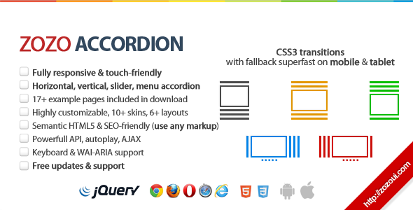
Featured UI Component: Accordion
Check the features below our featured ui component.
UI Components by Zozo UI
Zozo Accordion - Fully Responsive and touch-friendly jQuery Accordion plugin
jQuery Accordion Plugin
Zozo Accordion is Fully responsive and touch-friendly with a lot of customization options that can be integrated into your site/blog quickly without writing any code. Some of its key features includes: such as CSS3 transitions with jQuery fallback, horizontal, vertical, slider, menu accordion, load content with AJAX, custom styled scrollbar for Webkit, 10 unique themes, semantic HTML5 and SEO friendly and much more. Note: This is not a WordPress plugin but it can be easily integrated.